Unless you’ve been living in one of the sea caves along the Lake Superior shoreline, by now you're likely well aware that the state of Minnesota is officially going through the process of redesigning its state flag and seal. In fact, if you’re a regular follower of ours on Instagram, you probably helped us out by weighing in on our design voting back in July (full process in our story highlights), submitted a few designs of your own and there's a somewhat decent chance you've already gotten a little tired of hearing about it - and you know what - that’s completely fair. We can’t really say that we blame you. While our enthusiasm hasn’t waned, we’ll still try to keep this brief and let the visuals do most of the talking.

For a quick recap, here are the designs we submitted to the State Emblems Research Committee (SERC) back in October…

Well, It’s been roughly 2 weeks since we learned that one of our seal designs made it into the group of 5 finalists selected by the SERC. Now, I have to say, while, at first, we were a little bummed to see our flags not make it to the finals, it was a complete honor and thrill to be included in the final round of the state seal design. Our gratitude to the committee for their consideration and inclusion cannot be overstated. However, as of yesterday it seems our design will not be “the chosen one” 🥲 and ya know what… that’s okay. The good news is that the state is getting another great option instead thanks to the immensely talented Ross Bruggink. 👏👏👏
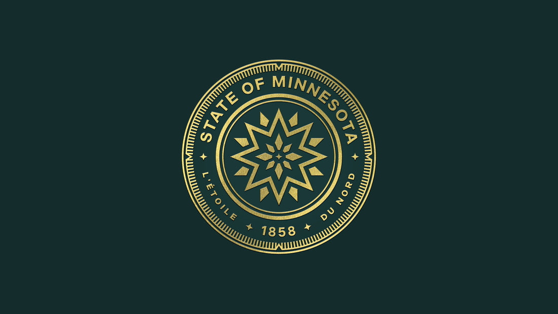
For one last time, here is what it just might have looked like to have the design our followers helped us create ( “Stella Borealis” - the Star of the North) make it to the final printing processes…


Finally, over the past 2 weeks there's something we’ve been really wondering about… you see, because our designs were all based on the idea of making an iconic symbol for our beloved “North Star State"... and all 6 finalists for the flag design were also centered around this same theme... it seemed highly unlikely that our our North Star and another designer's North Star would both be selected to represent the state as originally conceived. It made us wonder if perhaps there wasn't a bigger opportunity out there, still being left on the table?
What if Minnesota took the opportunity to look at this process through a different lens? What if rather than considering the flag and seal to be a set of static elements, which may or may not relate to one another, the elements were instead built from a kit of the same geometric parts - like cousins, quite literally “cut from the same cloth”? Very much like the kind of patchwork quilt that many of the current flag design options are constructed around.
And after wondering for a while, we went down the following rabbit hole and had a bit of fun. While our designs may not be alive anymore, we'd love to send them out with a heckuva good time. Would love to hear what you think. (p.s. make sure you scroll through to the end before making up your mind).


*Special thanks to Minnesota based type studios for being consistently amazing. All type used throughout this post was sourced from the following two studios:
https://processtypefoundry.com/
https://www.marksimonson.com/